Monday, June 30, 2008

last gig

Ever since my college days, I've done occasional freelance work for the same guy painting children's murals. Today's my first day on a new project, so it seems timely to show some photos from the last gig I had (I think it was last October), which was to make 40 or so individual paintings of boats (and boating accessories) for this one kid's bedroom. Wow is right.


Sunday, June 29, 2008

Self Portrait V


Made this one within a few days of the last. A little softer because of the hatchy technique, maybe more realistic, but missing some of the character of the other, especially in the eyes I think.

Thursday, June 26, 2008

Self Portrait (4)


An old self portrait from when I rocked a glorious telephone-cord-spiral jew fro. Self portraits were more fun then, with that added visual element to play with. Oil, oil pastel, soft pencil on foam-core.

Wednesday, June 25, 2008

two pages


Two pages from a comic that I started years ago and never quite finished. I still dig the concept so I'll probably come back to it some day, but I'll have to redraw the whole thing since it's been so long. There's just no way to fake it.

I can only think of one example off the top of my head of anybody trying to add stuff years after the fact: Dave Cooper's "Dan and Larry" collection. I think he had to add a few panels here and there because the dimensions of the book were different than the original serialization. And man do they stand out like sore thumbs. But how could they not? He put his heart and soul into the original drawings, and now he has a different heart and soul. If you have to devote a chunk of your brainpower to imitating your old sensibilities and devices, that's a chunk that's not going into the drawing itself.

Tuesday, June 24, 2008

Stripes


My friend KC asked me, what's with the stripes I use on/in many of my figures? Well, stripes are a good way of mixing color optically, like evenly spaced red and blue stripes = purple. And stripes are a really good way of describing form, such as on a topographical map. Plus a cool contrast with organic forms, like above.

Stripes are also a great device for organizing colors in a way that seems somehow natural. It's something I learned from my dad, and so sort of a tribute to him when I do it.

Making abstract art, which he does and which I used to and still informs my figures, means having to contrive a system for putting your colors on the page; you don't have a preexisting subject to do it for you. The system you use can easily make your painting seem silly or fake or dated. But compositions of stripes refer just enough to naturally occuring forms, such as in sunsets, canyon walls, that they can be a relatively inconspicuous device in an abstract painting. They're also endlessly versatile because their width, direction, and color are so variable.

Monday, June 23, 2008

Funny, the little things that stick with you:

Above is a drawing of my brother's roommate taking a sip of coffee and commenting on how strong it turned out. He, however, made the coffee himself and was in complete control of how strong it was going to be. So, apparently, it seemed to me, he chose, consciously or not, to allow some degree of unpredictability into his coffee making process. (This happened years and years ago (though this drawing I made today)).

Doesn't sound like much, and admittedly, that might not even have been what was happening (I didn't ask him about it). But, at the time, to a young dude like myself, both fairly uptight and fairly naive, it neatly symbolized a broadening of mind that I was (and still am) navigating. So neatly that the little tableau still pops into my mind now and then when I'm thinking along such lines. There's a whole catalog of moments like that, crystallized trains of thought, that flit through my minds eye each day. I wonder if that's how other people think?

Sunday, June 22, 2008

Friday, June 20, 2008

unsuccessful stab pt. 2

A bit more design work from an old pitch.

Thursday, June 19, 2008

Self Portrait 3

Like the stargazer from Monday, trying to push my compositions to the edges of the page

Wednesday, June 18, 2008

unsuccessful stab pt. 1


Here's some more work from the unsuccessful stab I took at getting a designing gig at a 3D animation studio. (And here's the other work from the earlier post.)

Tuesday, June 17, 2008

right there


Hey- sorry I'm late. Technical problems. Anyway- here's a recent drawing I'm really happy with.

Monday, June 16, 2008

Behold the Stars


A rare attempt to add some narrative to my work. This city guy's out in the country marveling at the unfamiliar stars, when he sees the image of his beloved, who's back in the city, formed there. The house he's staying at is in the distance. He might also be a Jew, since he's wearing something like a yarmulke.

Sunday, June 15, 2008

Self Portrait II

Tom's internet connection is down so the weekend update has fallen to me. Here's a self portrait I did around the same time as this one.

Friday, June 13, 2008

Mesh Girdle?

I thought it would add some of the poignancy I love if I used the same placement I use when making paired figures but then just leave one of them out. (Notice the continued similarity to the Progenitor)
Thursday, June 12, 2008

oldies


Here's a few oldies that I'm still fond of and which needed a new home.

Wednesday, June 11, 2008

Progeny


I've got a few color schemes that I'm drawn to and have to fight myself not to use every time I do a new piece. Orange/Grey/Electric Blue. Pink/Baby Blue/Black. Pale Yellow/Green/Purple. In this case my old stand-by, Red/White/Forrest Green.

Tuesday, June 10, 2008

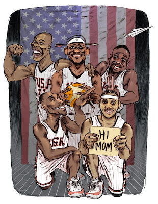
Dream Team: 2008

A piece I just finished for King Magazine. From top left, clockwise, we've got Dwight Howard, Lebron James, Dwayne Wade, Carmelo Anthony and Kobe Bryant.

When I finish up a drawing, I usually rotate it (in Photoshop) a few times and examine it from different angles. I did it with this one. It's a way for me to see and appreciate the drawing in a sorta fresh light, after having just stared at it for 10 hours or so. Photoshop also lets you flip the image to a mirror vesion. Conversely, this does not aid in appreciation, this makes the drawing, specifically the faces, look monstrous and distorted (so I don't do it often, but I did it this time (I get curious)). Does this happen to anyone else? I really don't know what to make of this effect. It happens pretty much every time. I can't tell if it's just the shock that makes it look weird, or if a real defect is being revealed...

Monday, June 9, 2008

Progenitors II


At one point during my transition from exclusively making non-figurative paintings into exclusively making drawings of human figures, I tried to make a figure using the technique I was employing for my abstract work at that time (illustrated here with a painting titled "Bier Guarding"). What I would do was put down small blobs of paint around a surface and then squash it all with a piece of plexi-glass so that the blobs spread out over the surface and joined without leaving any brush strokes. Then I'd repeat that a couple more times. The idea was for the paint application to be and to look more "natural".

Anyway the figure turned out pretty bad, because the technique doesn't allow much control unless you're extremely precise about the size, shape, and position of your blobs. Which sort of takes the fun out of it. But so even though the features were hard to distinguish, I really liked some of the shapes that came about, particularly the overall silhouette.

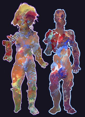
This drawing, then, is an interpolation of a painting that was vague and distorted because I was using an inappropriate technique to create a human figure. Squashed paint has been reinterpreted and articulated as spongy deformations. I think the deformations and mutations, in combination with the festive colors, have a poignant effect.

Saturday, June 7, 2008

Meathaus Postcard

An image from an old promotional postcard for the Meathaus comics anthology.

Also: if you're attending the MOCCA festival in NYC this weekend, be sure to stop by the Meathaus table and check out our first full-color book, "SOS". Top notch.

UPDATE: I was at the festival today, but no books. They didn't get shipped in time. Dang...

Friday, June 6, 2008

Progenitors


Adam and Eve as some kind of rainbow zombies. I think all of the figures I've been doing for the past couple of years started with the male figure in this piece, although this is actually his second appearance. I'll post and describe his first appearance next time.

Thursday, June 5, 2008

rejects* pt.2

*Only "Wuz Entmee" was actually rejected. "Kiki and Neesy" is still under consideration over at Nick, but I thought I'd throw it in here anyways. The last one, with the wolfmen, was such a failure that I didn't submit it. Self-rejection I suppose. It may have the most complicated, least comprehensible, least funny "punchline" of all comics ever.


Wednesday, June 4, 2008

Before & After


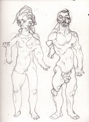
Here's another "base layer" drawing. This one actually did get painted upon, and it changed quite a bit in the process. This is a good example of something I used to do pretty often, which is letting the loose brush strokes I use to paint the figures change the figures' silhouettes, such as the guy's right hip, and the girl's hair and the small flowery shape on her upper right arm.

Tuesday, June 3, 2008

rejects pt.1

Three rejected strips that I submitted over the years to Nickelodeon Magazine's comics section.
I'll post some more on Thursday.


Monday, June 2, 2008

Teal


Same method as the lavender woman, even more distorted.